Wouldn’t it be fantastic if we had a resource at our disposal that could pinpoint suburbs with imminent boom potential and identify those with the highest long-term growth potential? Property market analyst and educator John Lindeman argues that this tool is within reach – and best of all, it’s free

Wouldn’t it be fantastic if we had a resource at our disposal that could pinpoint suburbs with imminent boom potential and identify those with the highest long-term growth potential? Property market analyst and educator John Lindeman argues that this tool is within reach – and best of all, it’s free
Imagine if we could use such a tool to quickly assess whether rent demand is rising or falling and what types of housing are in the greatest demand in any suburb of our choosing?
We can do all this and more with census data. However, the bad news is that we can only rely on this information some of the time, because the census is only conducted every five years.
As time passes, the data becomes less accurate, because people move around and the types of housing change as well. The good news is that we are about to start one of those five-year periods, as the latest census data is about to be released by the ABS.
How to access the latest census data
Most investors never look at census data because it seems too complicated, but it’s easy if you know where to look and how to make use of it. Best of all, this treasure trove of invaluable information is available online, and it’s free.
The easiest way to access census data is with QuickStats, which provides a snapshot about people, their occupations and income, family types, dwelling characteristics and types of tenure, such as the number of properties being rented, being purchased, or fully owned for any suburb, local government area or region. To find QuickStats on your computer, simply google ‘QuickStats ABS’.
The drop-down menu allows you to select a census year – such as 2016, 2011 or 2006 – and you can choose a location by typing its name into the ‘Enter a location’ box.
You may find that there are many locations with the same name, because Australian place names and localities are full of quirks, oddities and traps for the unwary. Some suburbs have the same names as regions and local government areas, so be sure to check that you are looking at the correct geographical unit.
For example, a search for Blacktown using QuickStats produces 21 results. If in doubt, select the suburb, because you can then use other suburb data, such as the median house or unit prices and the sales and rental information provided in the Property Price Guide at the back of this magazine.
Many suburban names are duplicated, so be sure to check that you are looking at the right suburb. Australia has nine Springfields, seven Red Hills and six Richmonds, and the same name can even appear more than once in the same state, with three Kingswoods located in NSW alone.
That’s why, after you have found your desired area and clicked the GO button, QuickStats has a map that shows you where the area you have selected is located.
How to navigate your way around QuickStats
Once you have clicked the GO button, you will see a summary of the basic information about the people, families and dwellings located there.
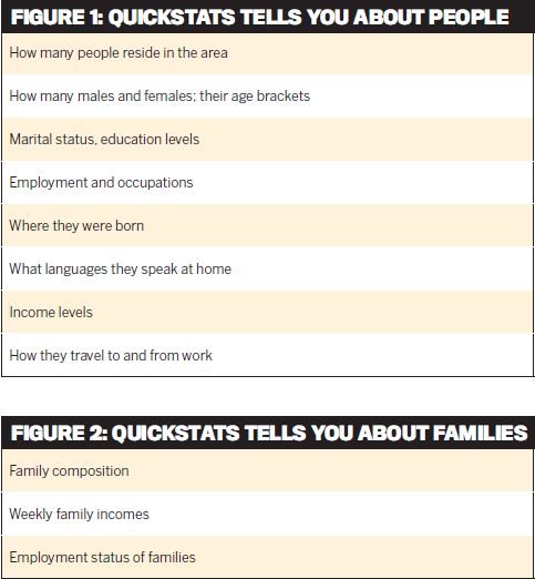
If you click on one of these three headings, much more information is revealed. For example, Figure 1 shows you what QuickStats reveals about the people who live in the area you have selected.
If you want to know more about the types of families who reside in the area, QuickStats shows you, as Figure 2 indicates.
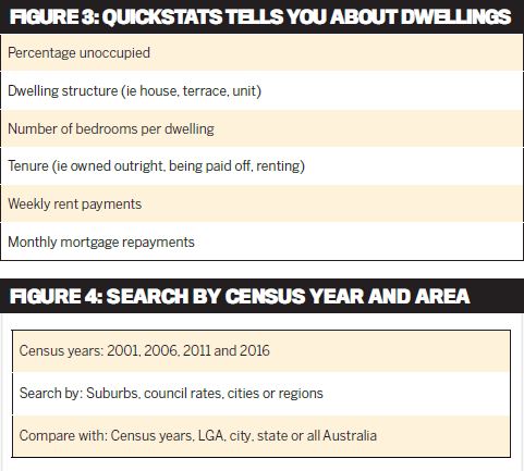
And if you are interested in the types of dwellings in the location you have chosen, QuickStats provides a wealth of detail about them, as Figure 3 demonstrates.
Not only does QuickStats provide this information for any suburb of your choice, but you can compare the information with larger areas, such as the local government (council) area, an entire city, a region, the entire state, or you can see how your selected suburb compares to Australia as a whole. You can also see how the area is changing by comparing the information from each census, as Figure 4 indicates.
The power of QuickStats
QuickStats will quickly show you who is calling the shots in any market area – eg whether most residents are renters and, if so, whether they are overseas arrivals, new households, opportunity seekers such as students, or construction workers or permanent renters. Armed with this information, you will know not only where rents are likely to rise and where they will fall, but what types of properties will be most in demand by tenants and why. QuickStats can answer questions such as:
- Are most owner-occupiers paying off their homes and, if so, how much are their repayments compared to household income?
- How is an area changing in terms of population, types of families, employment, industries, transport or incomes?
This information tells you where first home buyers, upgraders, retirees and investors are buying into and where they are selling. This empowers you to know not only where to buy and which suburbs to avoid, but what types of property will be most in demand and why.
Locating the biggestpotential boom market
Around a quarter of our population is aged 50 or over, and many of these people will retire in the next few years. Their shares and superannuation have gone nowhere since the GFC, but many potential retirees, particularly in Melbourne and Sydney, have seen the value of their empty-nest family home more than double in the last decade.
While the prospect of selling the family home with its comforts and memories is often dreaded and put off as long as possible, for many retirees it is the only opportunity for acquiring a nest egg for the future. The number of retirees moving to a retirement location is likely to grow rapidly and will have significant effects on the housing markets where they choose to go.
Where will they move to? In order to achieve their nest-egg goal, they will move to areas that have a median house price much lower than the price of the family home they are selling.
They will also search out areas that offer a better lifestyle, appropriate health, recreation and entertainment facilities, and where they will have the company of similarly aged neighbours. This explains the extremely high growth in retiree housing markets that has occurred in the past – retirees tend to move to the same locations at the same time, creating some spectacular housing price booms. Even so, each retirement location has its limits, because virtually all retirees endeavour to have enough cash left over from the sale of their home to spend or keep for the future. If there’s been too much price growth in their desired location, new retirees will seek another more affordable area where they will still have cash left over, creating more demand for housing as they move.
Most of the great retirement boom markets in northern NSW and Queensland, such as Byron Bay and the Gold Coast, were created by these retirees and ended when they stopped moving there. These retirement locations have a recurring pattern of housing price growth and decline that is closely tied to the life cycle of their retiree residents. It all begins when a new retirement area is ‘discovered’ by retirees and as it becomes popular the housing market booms as demand rises.
Demand increases further as the nature of business and commerce changes to accommodate the needs of retirees with specialised health care, therapeutic, education, entertainment and recreation services. The initial retirees also help to transform the town, having both time and money on their hands. These are now the locations that it seems everyone wants to retire to.
Housing demand in such locations keeps rising, along with prices, until the cost of purchase exceeds the capacity of new retirees to buy. Then it starts to change as demand falls away.
New retirees will shun such locations not just because prices are still relatively high, but because there are so many people older than they are, serving as an unwelcome reminder of what lies in store down the line.
As the older retirees start to pass away or go into hospices, their children and grandchildren sell the homes for whatever they can get, and as more and more properties come onto the market prices start to fall, until the area becomes affordable and the pattern starts all over again with the new wave of retirees.
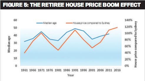
Figure 5 shows how this effect has periodically transformed the housing market in Byron Bay, a popular and beautiful seaside location in northern NSW. You can see that the median age of residents is closely aligned to the median house price of Byron Bay compared to Sydney.
During the early 1960s and ’80s retirees flocked to Byron Bay, causing the median house price to more than double. When the house price rose above that of Sydney, each retiree boom ended because house prices had become unaffordable. Then as each succeeding generation of retirees moved or passed away, house prices fell again.
Figure 5 also shows that when Byron Bay’s house price was lowest, so was the median age, even lower at those times than the national median age of around 37.
This story has been repeated in all the popular retiree destinations, such as Queensland’s Whitsundays, Sunshine Coast and Gold Coast, the Blue Mountains in NSW, Victoria’s Mornington Peninsula and Lakes District, the Fleurieu and York Peninsulas in SA, and the Coral Coast and towns in the Great Southern region of WA.
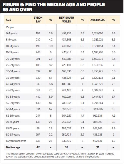
While now is obviously not the right time to buy a house in Byron Bay to onsell to a retiree couple in a few years, this may not be the case with other potential retiree areas. To find them, use the Property Price Guide in the back of this magazine, and look for well-located towns where the median house price is around half that of the nearest capital city and where prices have not been falling in the last few years. Then find the same town in QuickStats and check the median age as shown in Figure 6.
What you are looking for in QuickStats is those towns that retirees are starting to move to, which means a median age that is higher than the national figure of 37 and that is rising when compared to previous census years.
Figure 6 shows that according to the 2011 census the median age in Byron Bay was then 42, and it is sure to be higher now, but the issue here is that the house price has risen to the point where it has become unaffordable. So, even though the percentage of residents aged 65 and over is around the national average, retirees will not be moving to Byron Bay because they can’t afford to.
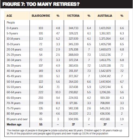
On the other hand, Figure 7 tells a completely different story, and shows us that the median age in Victoria’s Mornington Peninsula suburb of Blairgowrie is 55. This means half of the locals are aged 55 or more. The summary below the table also indicates that one third of the suburb’s population is aged 65 or over. This is an area to which retirees were attracted some years ago, but not any more.
The new 2016 QuickStats will show you how the population is changing in Blairgowrie, and this in turn will indicate which way prices are likely to move. Given that the median house price in Blairgowrie is already higher than that of Melbourne, it is unlikely that more retirees will be attracted to this otherwise beautiful part of Victoria.
These two simple research steps will enable you to produce your own list of potential retirement areas, and when you’ve identified that a new retiree boom is about to start, you’ll be ready to ride the wave of growth as it occurs.

This article first appeared in MPA's sister publication Your Investment Property

