The Reserve Bank has just released a range of charts with insights into house prices; lending; interest margins and much more

The Reserve Bank has just released a range of charts with insights into house prices; lending; interest margins and much more
The Reserve Bank has just released its first 'chart pack' of 2017, providing a range of visual explanation of all aspects of the Australian economy using the latest data available. The pack includes charts dedicated to housing prices; loan approvals, how debt and mortgage repayments affect households as well as interest rates, both within Australia and in other developed countries. Furthermore the charts provide a long term view, with many data sets starting in the mid-1990s, if not even earlier.
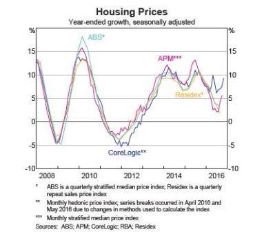
1. Housing prices
Although growth slowed in the first half of 2016, the RBA's chart shows it spiking as the year came to an end, albeit not reaching the growth rates seen in 2015.
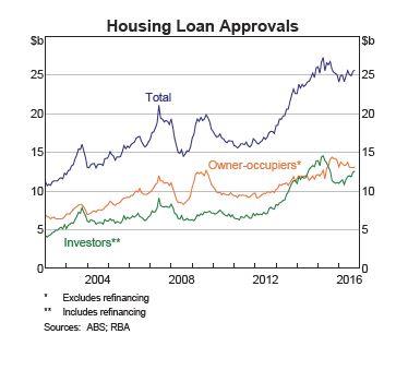
2. Housing Loan Approvals
If 2015 was the year that saw investors slammed by regulators and bank policies, 2016 was a year in which they made a steady return, coming close to overtaking owner-occupiers.
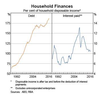
3. Debt and interest payments
These twin graphs tell the two contrasting stories of affordability in the Australian housing market. On the one hand spiralling prices, particularly in Sydney and Melbourne, have forced Aussies to take on more debt than ever before. Yet low interest rates mean that those with a mortgage are having to put less of their income into repayments.
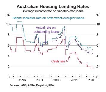
4. Variable interest rates
As they usually mirror changes in the cash rate, variable rates have continued to fall as the RBA responds to economic problems, both in Australia and abroad.
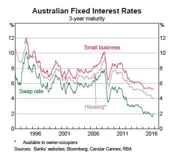
5. Fixed interest rates
Compared to variable rates, fixed interest rates tell a different story. Whilst not particularly evident on this graph, given its large scale and limited dataset, the flattening at the end of 2016 was a prelude to lender raising interest rates, in expectation of high funding costs and possible RBA rate hikes in 2017.
