Quicken Loans brand and sister companies get a refresh

Quicken Loans’ fully digital mortgage offering has been given a new look along with several sister companies.
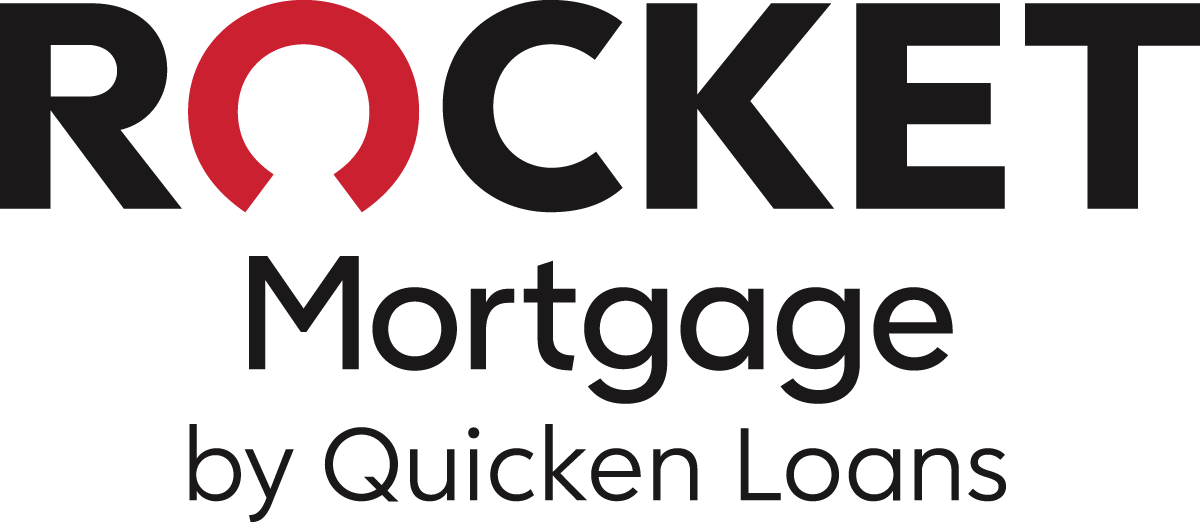
Rocket Mortgage, which launched three years ago and has grown its brand through Super Bowl commercials, national marketing campaigns, and prolific social media activity, has a new logo.

Some may be surprised to see the rocket symbol disappear from the new logo but Rocket Mortgage, along with its sister companies Rocket Home, Rocket Loans, and the newly launched Rocket HQ now have a ‘magic O’ as part of a revamped look.
Quicken Loans’ CMO Casey Hurbis explains that the new look better reflects the range of the Rocket Mortgage brand.
“Innovation, speed and client service have always defined Rocket Mortgage and Quicken Loans. Moving away from the visual image of the rocket allows us to showcase all of the ways we offer value to our clients, not focusing solely on speed,” he said.
Hurbis says that people see different things in the ‘magic O’ which again are reflective of the brand.
“Many have said they see an outline of a person — an intentional nod to keeping clients at the center of everything we do. Others have said they see the gauge of a speedometer to show speed or progress, or the keyhole of a door—one that we believe can be used to open up a host of new financial opportunities and freedom,” he said.


